The Art of Setting in Frieren
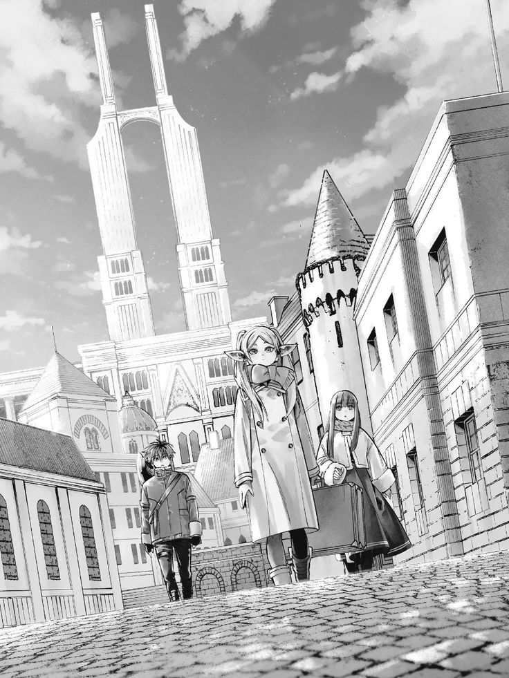
One of the subtler arts behind Frieren’s emotional impact is the poignant effect created by the series’ unusual investment in lush and detailed natural backgrounds in order to enhance narrative immersion and emotional resonance. #frieren 1/10
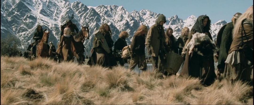
This strategy is, yet again, evident in Tolkien who somewhat famously would use descriptions of natural landscapes to punctuate and enhance scenes of high drama within his Lord of the Rings trilogy, an effect ably adapted to film in Jackson’s movies and their use of New Zealand panoramas. 2/10
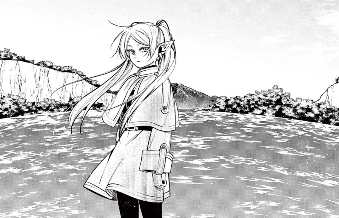
Similarly, Abe’s illustrations are lush and detailed to a degree that is rarely seen in modern manga, which tends to favour a more stripped down approach that aligns with the economic realities of manga publishing. The effects of eschewing that approach in Frieren are many. 3/10

For one, the world that Frieren travels through has a sense of texture and reality the likes of which are rarely seen outside of prestige manga works such as Akira, Look Back or Made in Abyss, all of which use detail to create hauntingly memorable worlds for very different stories. 4/10

Like those other works, Frieren invests time and labor in the background art to create an immersive effect that demonstrates to the reader a clear sense of the importance of setting to the story that is unfolding. In a quest narrative like Frieren, this helps to add weight and meaning to the journey. 5/10

Equally important, however, is the metatextual demonstration of the importance of the moment. The care and patience that Abe invests in background artwork is reflective of the broader philosophy of the story: take your time and appreciate where you are. Abe’s art inhabits this philosophy. 6/10
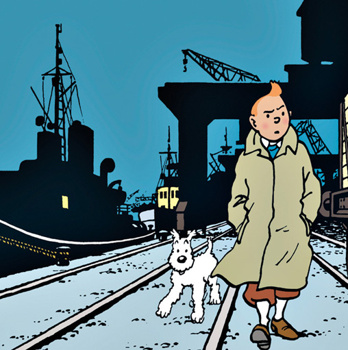
Finally, the combination of cartoonish visual renderings of character with more detailed backgrounds aligns Frieren with the famous ligne claire style of comics, most famously employed by Hergé in the pages of Tintin. 7/10
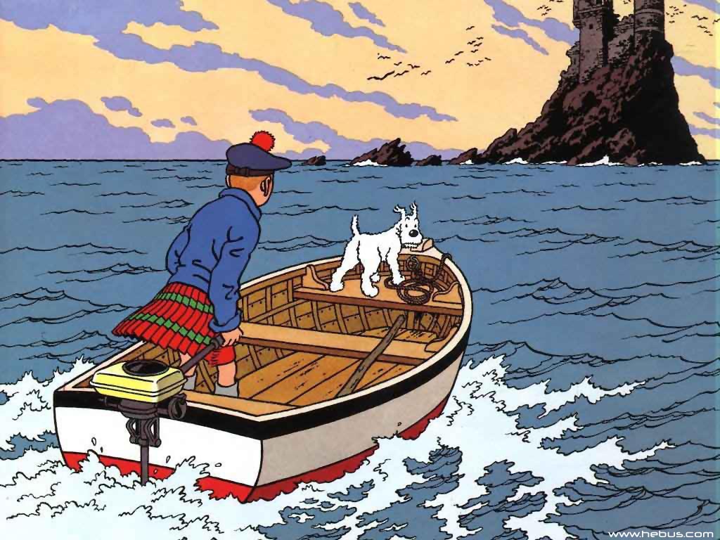
The idea behind the style is to maximize narrative immersion by juxtaposing easily identifiable (what Scott McCloud calls “neutral mask”) characters with highly realistic backgrounds. The viewpoint character is subjective while the background is objective in nature. 8/10

And indeed, we can locate this effect in Abe’s Frieren, which presents a beautiful and magical world in lush detail whilst inviting us into that world through simplified, cartoonish characters. In this, setting becomes forefront, meaningful, and inhabitable. 9/10

All of these effects – and the juxtapositions between them – make an invaluable contribution to a series that is already known for its unconventional tone and depth of fantasy immersion. Though operating in the background, Abe’s setting illustrations are by no means mere ornament. 10/10